

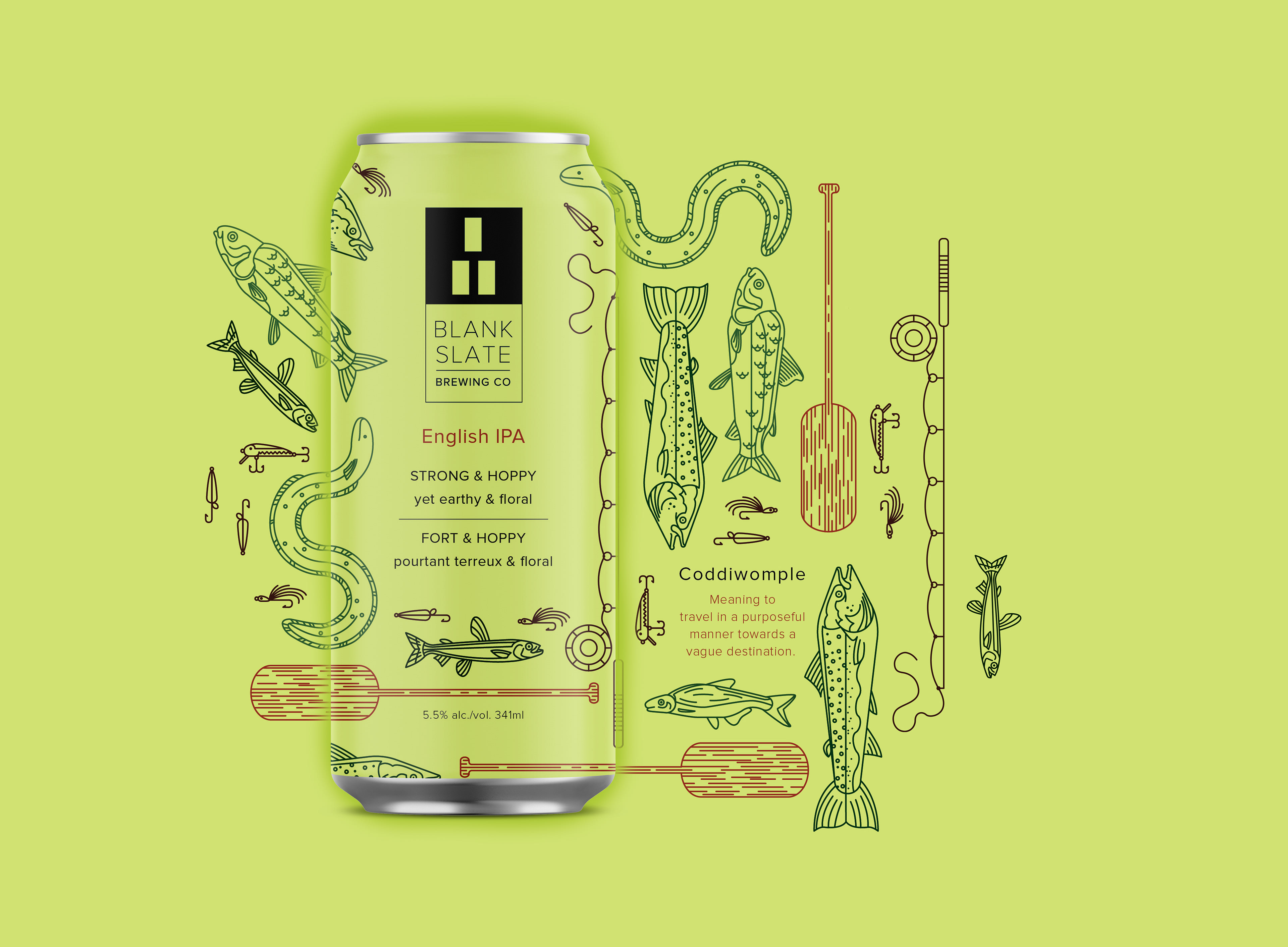
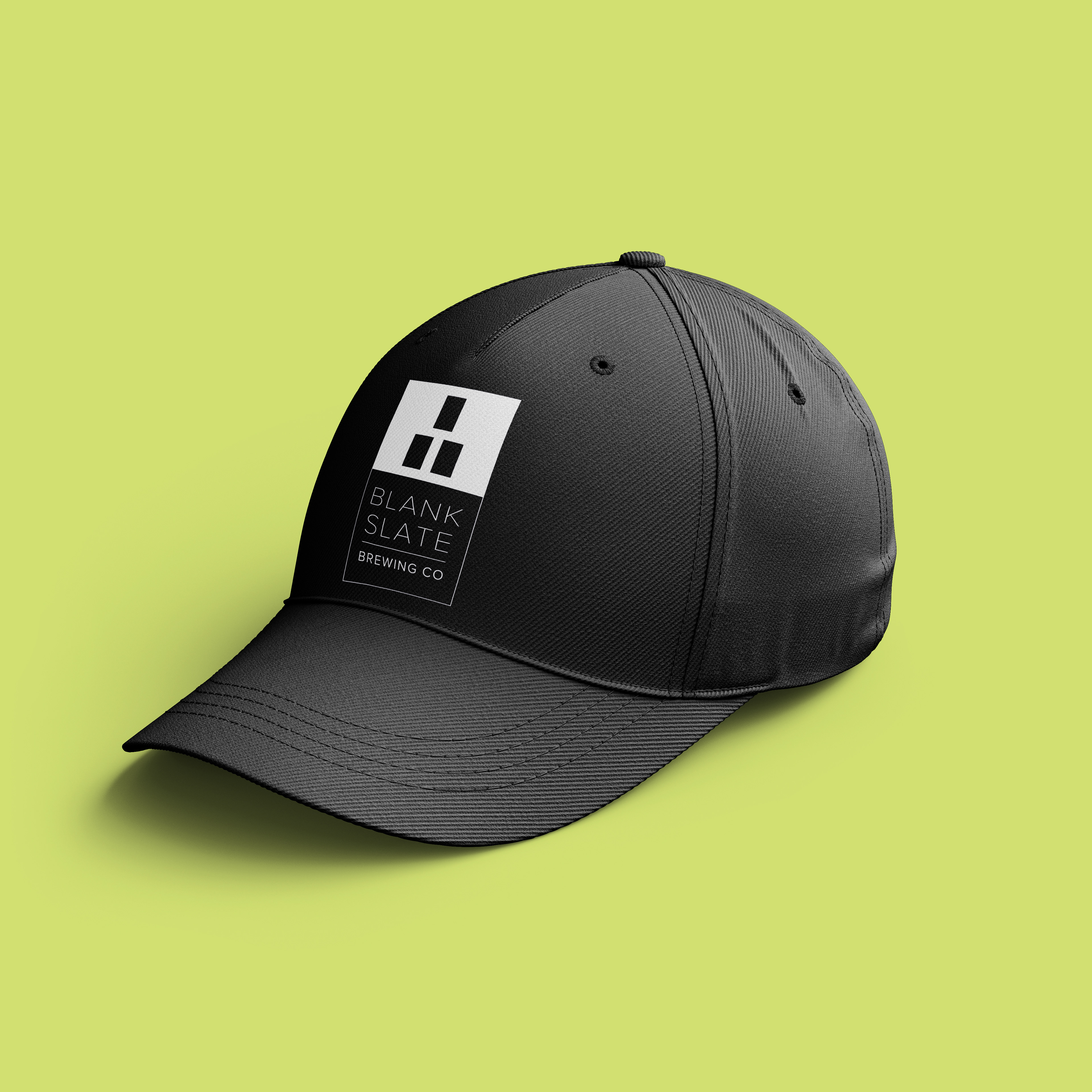
The concept behind Blank Slate Brewing Co lies within its own name; that every can starts a new adventure similar to starting a new story from a blank slate. This concept is also shown through the icon within the logo; the three rectangles are a representation of the ‘start of trail blaze’ that is used to mark on trees to let hikers and outdoors people know where a beginning of a trail is.
The target audience is people ages 25-40 who enjoy the beauty of the outdoors, with a focus on attracting women of the outdoors to the craft beer market. This is not only achieved through the flavour of the product itself, but also through the design elements – colour scheme, a modern minimalistic logo, and a slightly feminine feel. Overall Blank Slate brewing represents nature, strength, and that a company mission that the outdoors is meant to be enjoyed by everyone.
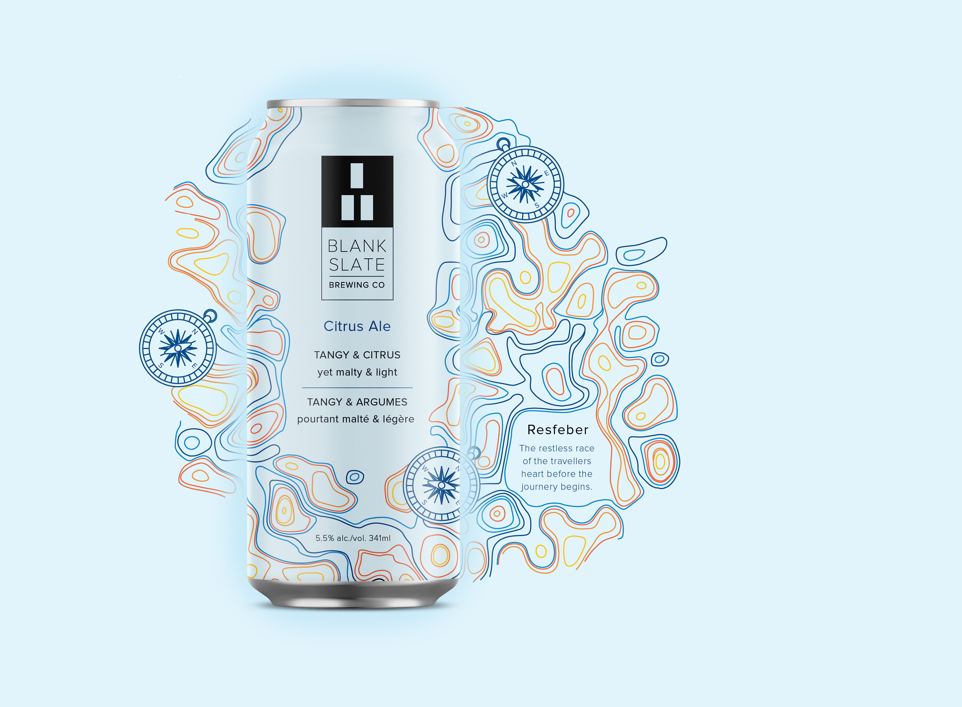
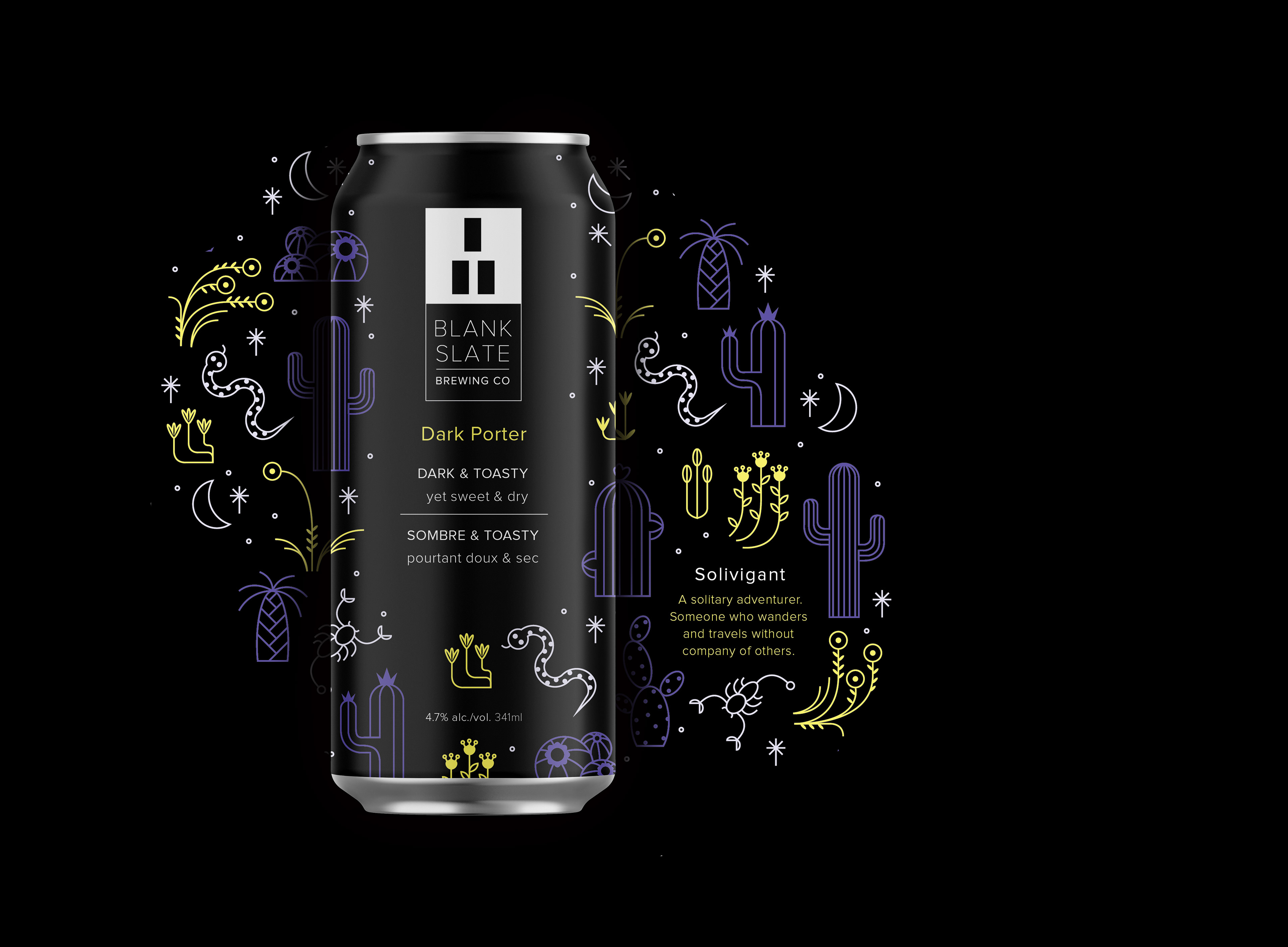
Three flavours make up the line: a Citrus Ale, Dark Porter, and an English IPA.
A microsite for Blank Slate features their current product and promotes upcoming releases. The website not only highlights what the company is all about but the projects they are working on as well.
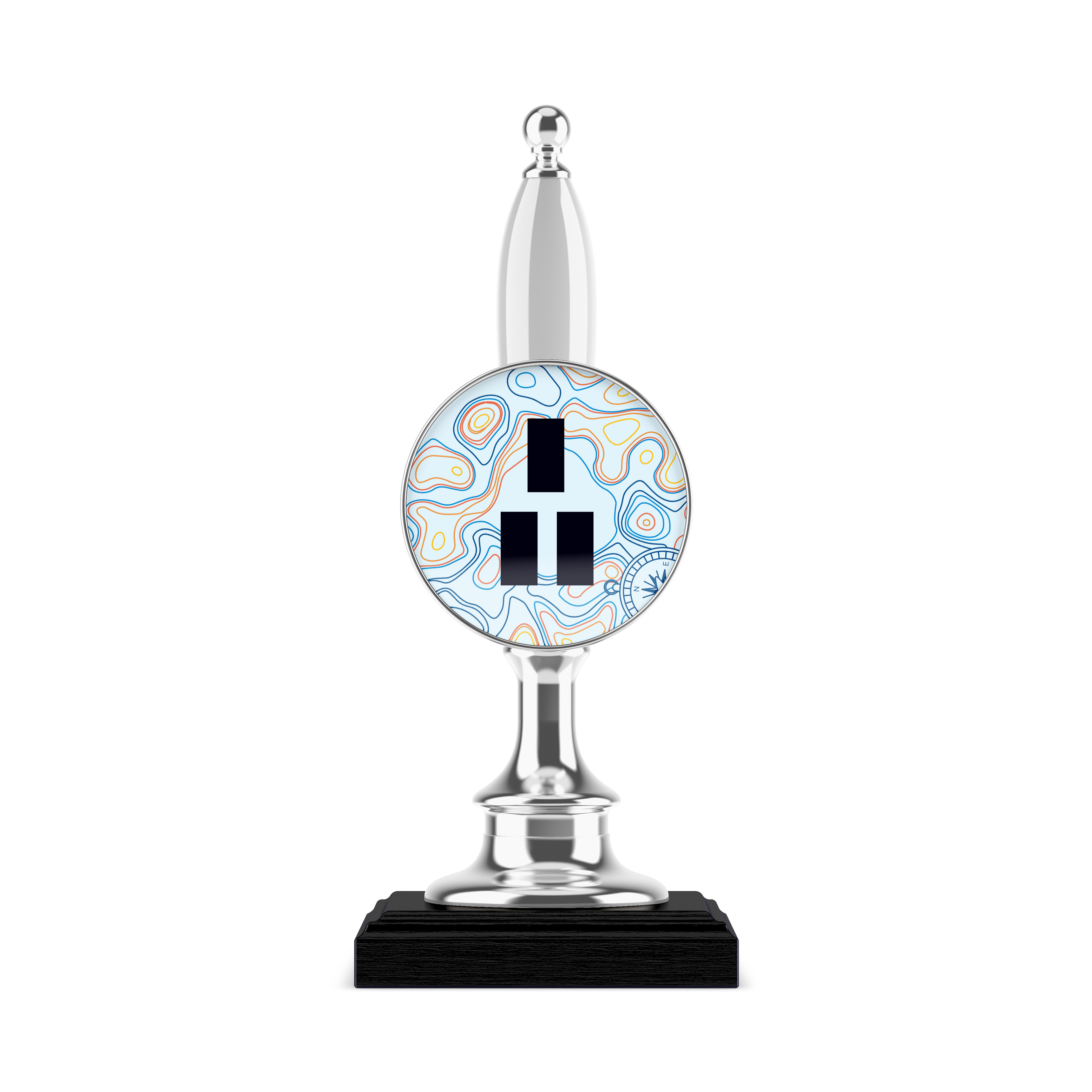
The logo and custom illustration assets applied to swag, such as coasters, a ball cap, and a beer tap.
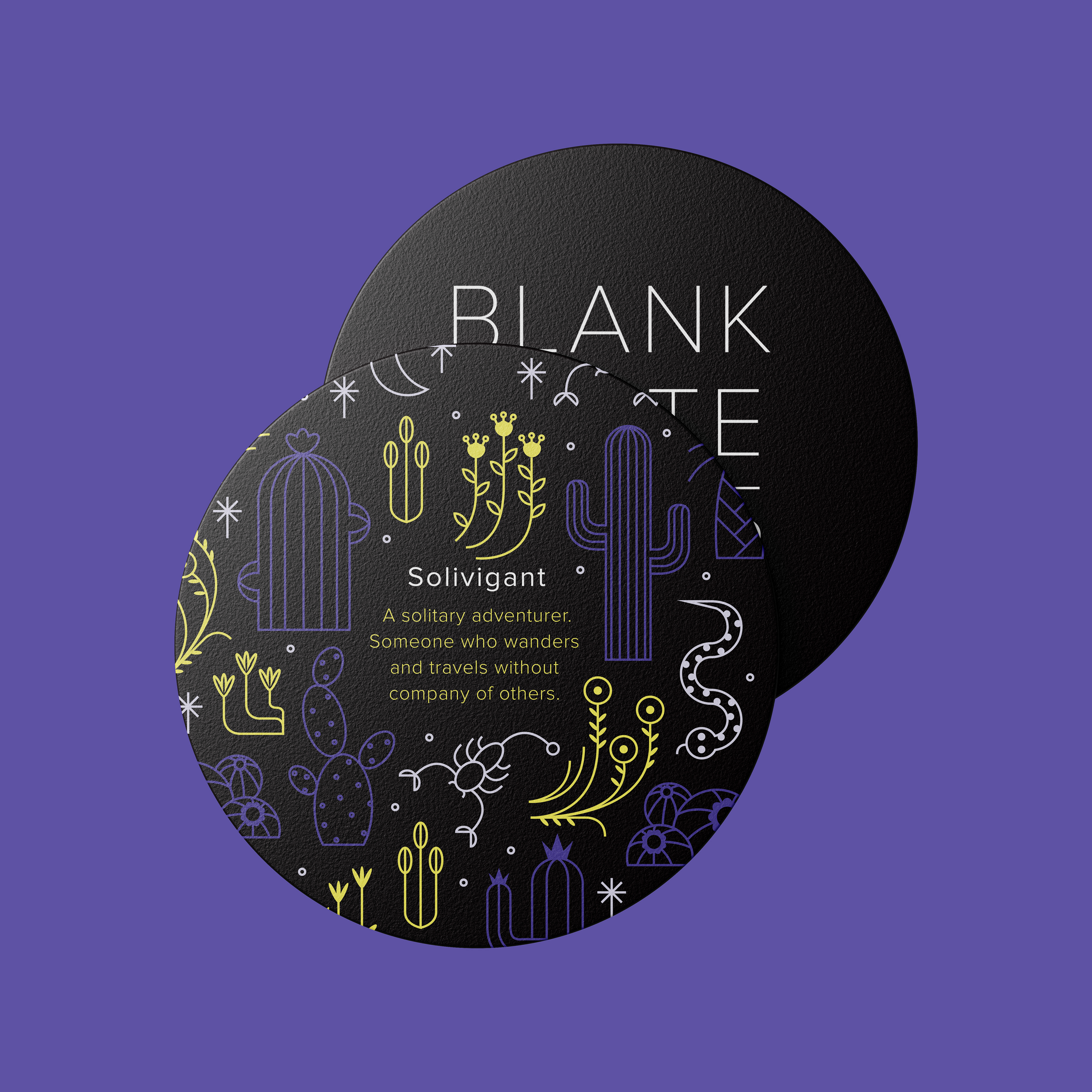
Blank Slate Brewing Co. is a conceptual project that combines logo/brand design, custom illustration, package design, and a microsite web-design prototype. All illustration, layout, and branding was completed by myself in the years during my college diploma in Graphic Design at Conestoga College.